DIFFERENT MINDS. SHARED ENERGY.
Better
together.
An original identity, amplified.
A visual world built around connection.
 ORIGINAL MARK / ARHUM KHAN
Fusion Nexus logo by Arhum Khan.
Strategy, colour, type, campaign & space.
Self-initiated brand extension / 2026.
01 / THE PROPOSED DIRECTION
Where ideas
meet their match.
A proposed identity for a creative collective: different perspectives, brought together to make something new.
The intertwined forms in Arhum’s logo suggest connection and exchange. This exploration develops that idea into intersecting paths, charged colour and short, direct statements. It is a new positioning exercise, not a claim about the original client brief.
02 / THE ORIGINAL SIGNATURE
Keep the character.
Build the system.
The original lettering, colours and
intertwined forms remain unchanged.
Two voices.
One identity.
The contrast between the light grey “Fusion” and lime “Nexus” is already distinctive. The surrounding system gives that contrast a consistent role.
Preserve the lockup.
No stretching, relettering or rearranging the supplied artwork.
Use its dark field.
On light surfaces, place the original artwork on a charcoal panel.
Original raster artwork used directly. A vector master is needed before final production at large scale.
03 / COLOUR & TYPOGRAPHY
Quiet foundation.
Electric accent.
Proposed extension palette; the supplied logo retains its original colour values. Use Carbon and Chalk for everyday content, Charge for a clear focal point, and secondary colours sparingly.
MORE
TOGETHER.
Compact, emphatic headlines give the campaign its voice. Short phrases leave room for the original mark.
Good things happen
between people.
Open, readable body typography balances the condensed display face. Both supporting families are separate from the original logo lettering.
FIELD NOTES — 01 / 2026
04 / THE CONNECTION DEVICE
Separate paths.
Shared momentum.
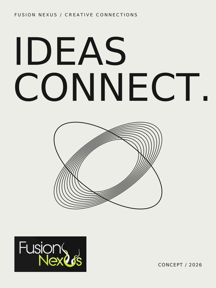
Intersecting elliptical lines create a supporting graphic language. Change the arrangement to see how the system moves from focused to expressive.
05 / POSTER SERIES
A few words.
A lot of energy.
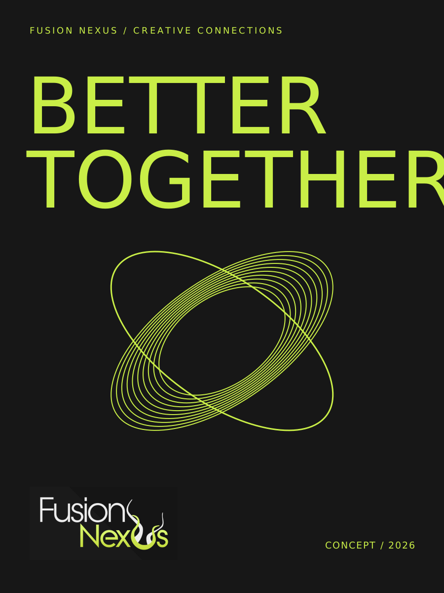
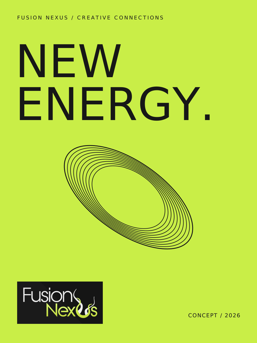
Three campaign studies.
Open each execution at full size.
06 / EVERYDAY CONNECTIONS
From the wall
to the invitation.
A small family of print and digital applications uses the same colour hierarchy, condensed headlines and original logo.
Flat artwork studies / proposed creative collective launch.
 LET’S
MAKE
CONTACT.OPEN STUDIO / CONCEPT INVITATION
WHAT’S
NEXT.
ONE MARK. A CONNECTED WORLD.
Built to belong.
Ready to expand.
A consistent system across posters, invitations, social artwork and space. The original mark provides the character; the new system gives it room to work.
Back to visual identities ↗Project notes
Original Fusion Nexus logo: Arhum Khan. Proposed positioning, visual system and applications: a self-initiated 2026 portfolio extension, not an executed client commission.
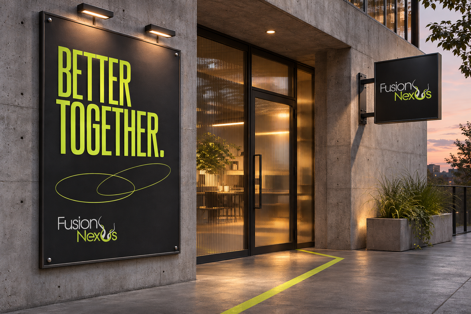
The studio photograph is an AI-generated concept mockup. Identity boards, posters and flat applications use the original logo artwork directly.