Barlow
Condensed.
Bold 700 · Semibold 600
Aa Bb Cc
0123456789
0123456789
Tall, compressed letterforms for campaign words and confident headlines. Set short phrases in capitals; give them room.
An identity built around immersion.
A more complete way to experience it.

Enter a different perspective. ↗
The original mark already contains an idea: a frame through which you see something differently.
This study takes that idea beyond the embossed-paper presentation. The visor becomes a compositional frame. The language of immersion carries into the imagery, typography and applications.
The original silhouette and uppercase signature remain the reference. Cobalt, architectural imagery and the layouts below are new proposals—not a record of the original client brief.
 01 / COBALT
Frame the
unexpected.
A compact set of choices: a distinctive display face, a clear reading face, a disciplined palette and the visor as a recurring frame.
Bold 700 · Semibold 600
Tall, compressed letterforms for campaign words and confident headlines. Set short phrases in capitals; give them room.
Regular 400 · Medium 500 · Semibold 600
Open, measured typography for explanations, navigation and useful details. Sentence case keeps the supporting voice approachable.
Ideas that invite you to look closer. Experiences that open another world.
Manrope Regular · 16–18 px · 1.6 line height. UI labels: 14 px / Semibold.Type a short campaign word. This is a live type specimen.
Both families are self-hosted here with their SIL Open Font License files. Barlow Condensed source ↗ · Manrope source ↗. These are proposed companion fonts, not a claim about the original logo lettering.
Signature colour. Campaign fields, key actions and the graphic frame.
Depth and contrast. Main text, dark compositions and grounding surfaces.
Breathing room. Light backgrounds and reversed type on dark surfaces.
Soft blue panels, quiet highlights and layered graphic details.
Neutral accents, separators and material-inspired graphic surfaces.
Tonal depth inside illustrations and darker campaign compositions.
Chalk 60 / Ink 25 / Cobalt 15. A guide to restraint, not a quota. A campaign poster can be entirely cobalt.
Use Ink on the pale secondary colours. Reserve Cobalt-on-Ink for decorative graphics, not readable text.
Keep a minimum clear space equal to 10% of the logo width on every side. Use the compact mark when the strapline would become too small.

Use Ink on Chalk, or Chalk on Cobalt and Ink. Preserve the proportions. Never stretch the visor or place it on a busy image without a calm area behind it.
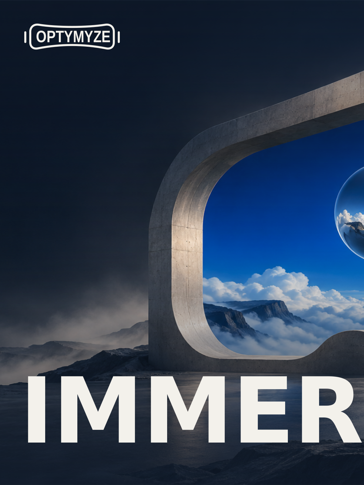
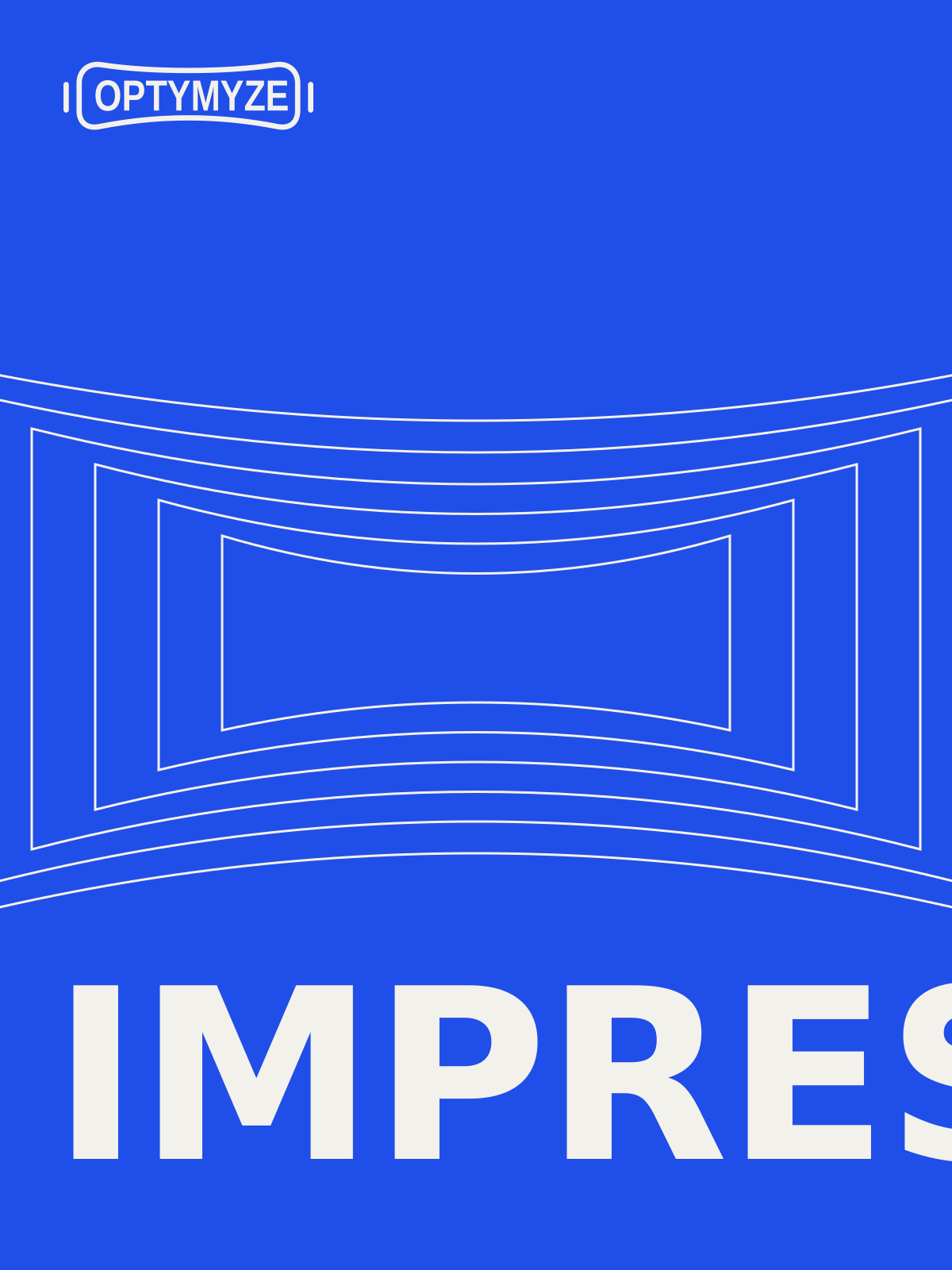
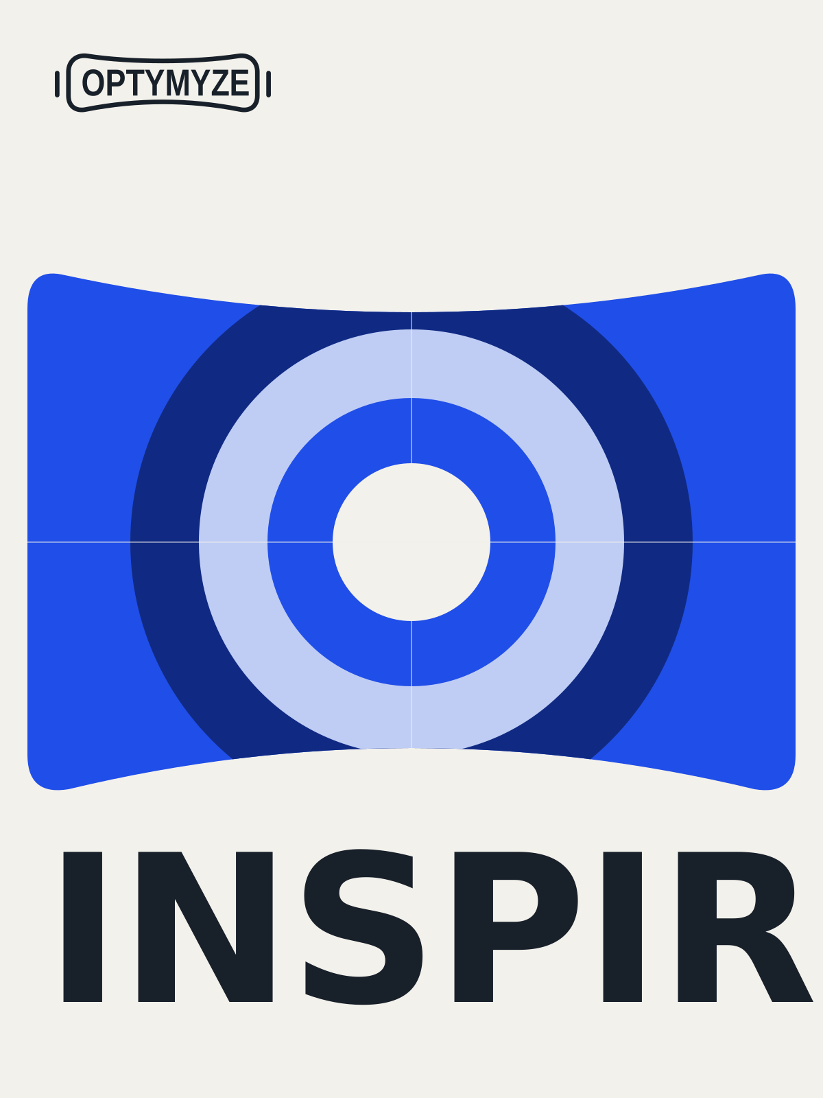
The logo, a single word, and a visual idea. Photography, linework and geometric form give the series variety without losing its identity.
Editable 3:4 SVG artwork with the display font embedded. Download for review or further design development; printer-specific colour conversion, bleed and final production checks are still required.
Download the brand specifications ↗A landing-page direction that carries the visual identity into a readable, responsive experience.
Experiences / Our perspective / Connect ↗Ideas that invite you to look closer.
Experiences that open another world.
Visual website concept. Navigation and button labels in this mockup illustrate the proposed layout.
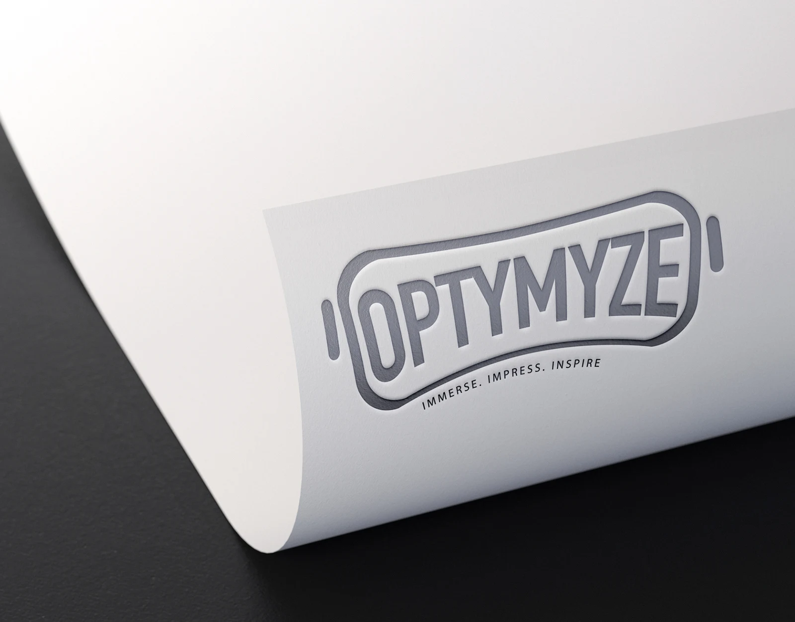
The existing wordmark and immersive idea, shown through a paper mockup.
IDENTITY → CAMPAIGN → DIGITALA reconstructed identity study, expanded through a consistent visual language and relevant applications.
The vector signature is a visual reconstruction from the available portfolio image, not the original editable master. Campaign imagery is AI-generated concept artwork. New applications are speculative; no commission, launch or performance results are claimed.