A NEW WORLD FOR AN ORIGINAL MARK.
Find
your flow.
A performance cycling concept.
Made for the momentum we share.
 SLIPSTREAMPROPOSED NAME / ORIGINAL SYMBOL
An existing emblem by Arhum Khan.
A cycling brand & collective.
Self-initiated speculative work / 2026.
01 / WHY CYCLING?
A mark already
in motion.
The swept silhouette suggests airflow. The outer arcs suggest rotation. Together, they offer a compelling starting point for a cycling identity.
Slipstream is a proposed performance apparel brand with a collective spirit: purposeful kit, shared rides and the pleasure of finding a rhythm. The name and category are invented for this exercise; they are not the original logo’s documented brief.
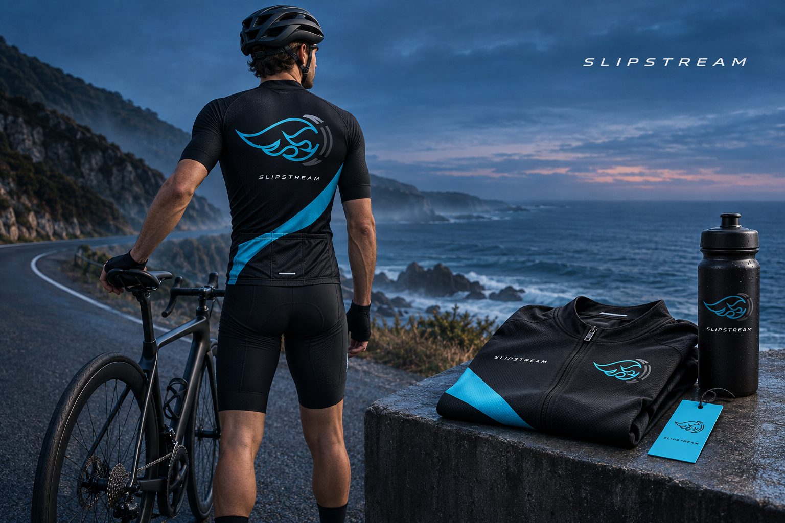
02 / A SYMBOL WITH A NEW ROLE
The symbol stays.
The story moves.
Original artwork, preserved.
A new name and visual context.
PERFORMANCE CYCLING / PROPOSED WORDMARK
A tight, forward-leaning uppercase wordmark complements the emblem’s movement. The new name is a separate supporting element, leaving the original symbol intact.
- Keep the original proportions and cyan-to-blue treatment.
- Use a dark field to retain the grey outer arcs.
- Give the symbol breathing room; keep it clear of seams and dense patterns.
The original raster artwork is preserved on the identity board. Production embroidery, reflective transfers and small-scale prints would need a vector master and physical sampling.
03 / THE BRAND FOUNDATIONS
Cold colour.
Clear intent.
Proposed palette for the new brand system. Original logo colours remain unchanged. Use cyan as an accent against dark kit, with generous pale space in editorial layouts.
FIND
YOUR FLOW.
Compressed, strong headlines echo the focus of performance sport. A slight italic treatment is reserved for the proposed wordmark.
Different riders.
One direction.
Readable, open typography for ride notes and product stories. Monospaced labels give supporting information a practical, organised rhythm.
RIDE NOTES — COLLECTION 01
04 / SUPPORTING GRAPHICS
Follow
the flow.
Parallel curves translate the idea of air moving around a rider into a repeatable visual device. They belong to the surrounding system; they do not replace or redraw the original emblem.
05 / CAMPAIGN EXECUTIONS
Built for the road.
Made to be seen.
Coast. Collective. Momentum.
Open each cycling campaign at full size.
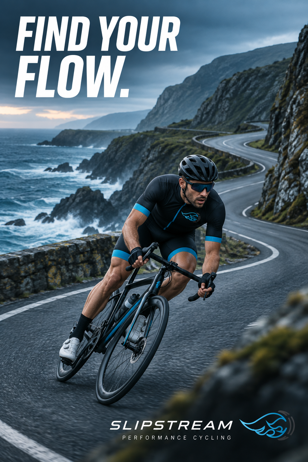
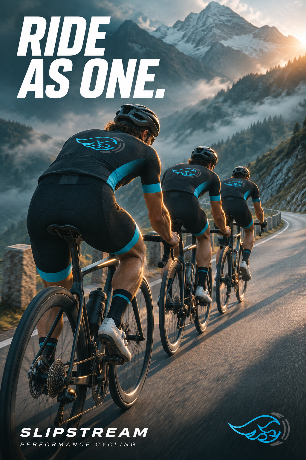
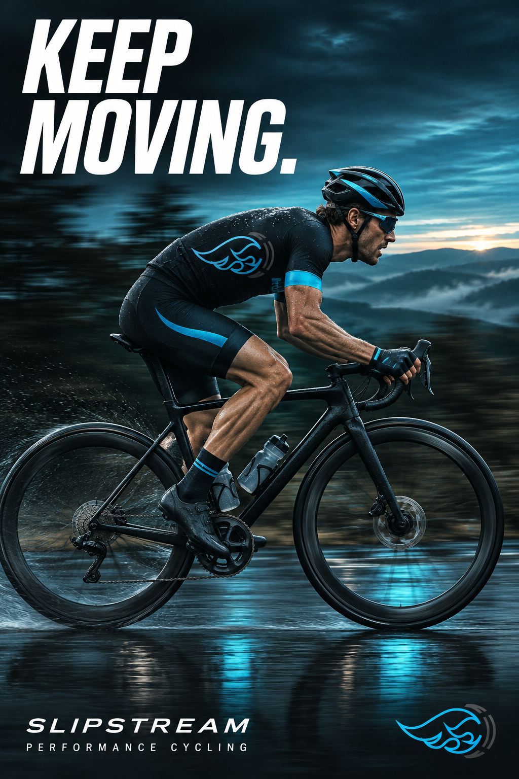
Photography-led campaign concepts / AI-generated cycling imagery.
NO ONE
RIDES
ALONE.
A SHARED PACE. A SHARED PURPOSE.
WEEKEND RIDE SERIESCONCEPT / SOCIAL INVITATION
06 / BEYOND THE PRODUCT
A kit to wear.
A reason to ride.
A community-led layer gives the identity somewhere to live beyond merchandise. Ride invitations use the same typography, spare language and colour hierarchy.
This social artwork proposes a welcoming collective around the performance brand. It is a design study, not a scheduled event or an operating club.
FROM EXISTING SYMBOL TO SPECULATIVE BRAND
A different context.
A distinct possibility.
The exercise connects an original emblem to a new audience and purpose, then tests its consistency across apparel, campaign and community communication.
Back to visual identities ↗Project notes
Original emblem: Arhum Khan. Slipstream name, proposed positioning and new executions: a 2026 speculative portfolio exercise. No client commission, commercial launch or product-performance claims are implied.
The cycling mockup and photographic campaign posters are AI-generated concept executions. The original-art board retains the supplied artwork unchanged. The working name has not been cleared for commercial use.