On the same
wavelength.
A studio identity built around connection.
One original logo. A whole visual language.
 THE ORIGINAL IDENTITY BY ARHUM KHAN
Arhum’s original Wavelength Studios logo.
Brand foundations, campaign, print & digital.
Self-initiated portfolio exploration / 2026.
01 / THE IDEA
Good ideas
resonate.
A proposed identity for a creative studio that helps ideas find their clearest expression.
The existing blue wave becomes the starting point for rhythm, connection and forward movement. The extension surrounds the original mark with a confident, flexible system for print, digital and physical spaces.
02 / PRESERVE THE SIGNATURE
The wave stays.
The world grows.
The wordmark, wave and STUDIOS lockup
are retained from the original artwork.
Give it space. Keep surrounding text and patterns clear of the lockup.
Keep it intact. Preserve its proportions, wave and original colours.
Let it read. Use a clean white field for the supplied colour artwork.
The original raster artwork is used directly. A vector master would be needed to finalise production-scale logo files.
03 / COLOUR & TYPE
A clear signal.
A confident voice.
Proposed palette for the extended system. The original logo retains its own blue and grey.
Make
waves.
Geometric confidence. Open shapes.
A strong partner for the original mark.
Ideas travel further
when they connect.
Regular weights keep longer copy approachable. Bold weights give short headlines presence without competing with the logo.
STUDIO NOTES — 01 / 2026
04 / A FLEXIBLE GRAPHIC DEVICE
Find the
frequency.
Supporting wave lines change their rhythm across applications. The logo itself stays fixed.
05 / CAMPAIGN EXECUTIONS
Less copy.
More resonance.
Three expressions of one identity.
Open or save each poster at full size.
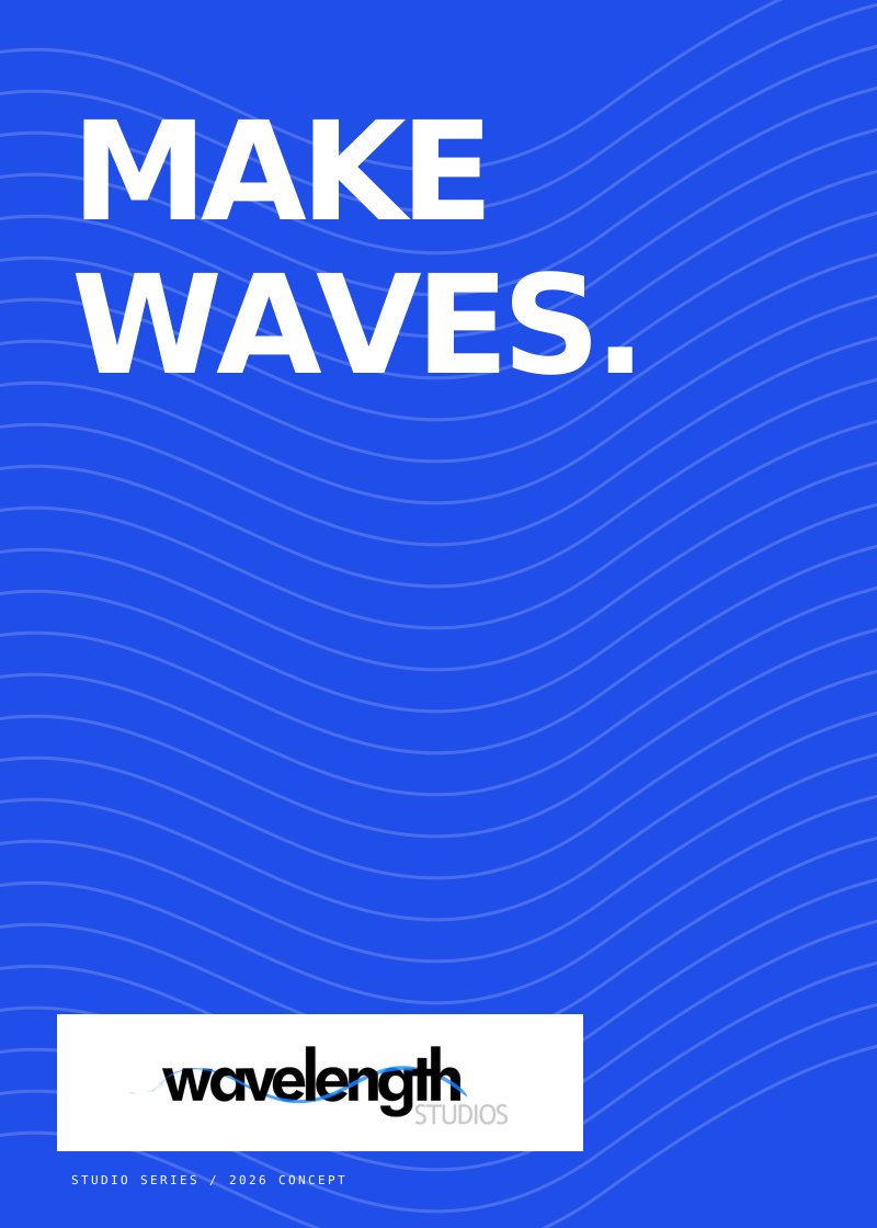
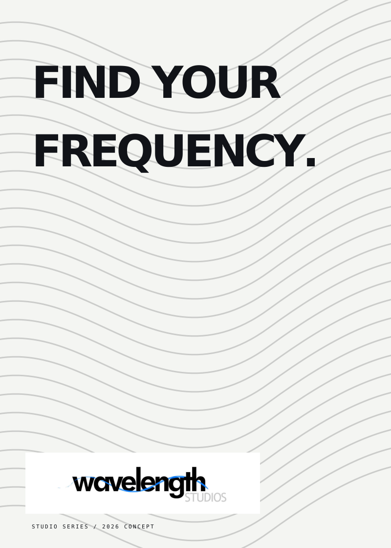
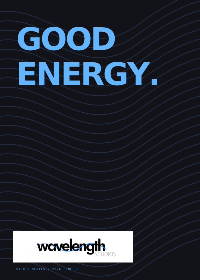 Selected work / Studio
Ideas with
an echo.
Make something resonate ↗06 / THE DIGITAL EXPRESSION
Same identity.
New surface.
A studio homepage concept carries the wave into a digital setting. Clear hierarchy, short statements and generous space let the work lead.
Static website design study, shown here as a brand application.
FROM LOGO TO SYSTEM
A recognisable mark.
A repeatable language.
The extension brings together a proposed positioning, colour roles, typography, supporting waves and a family of applications. The original logo remains the anchor throughout.
Back to visual identities ↗Project notes
Original logo and original presentation images: Arhum Khan. Brand system and new executions: a 2026 portfolio concept developed from that work.
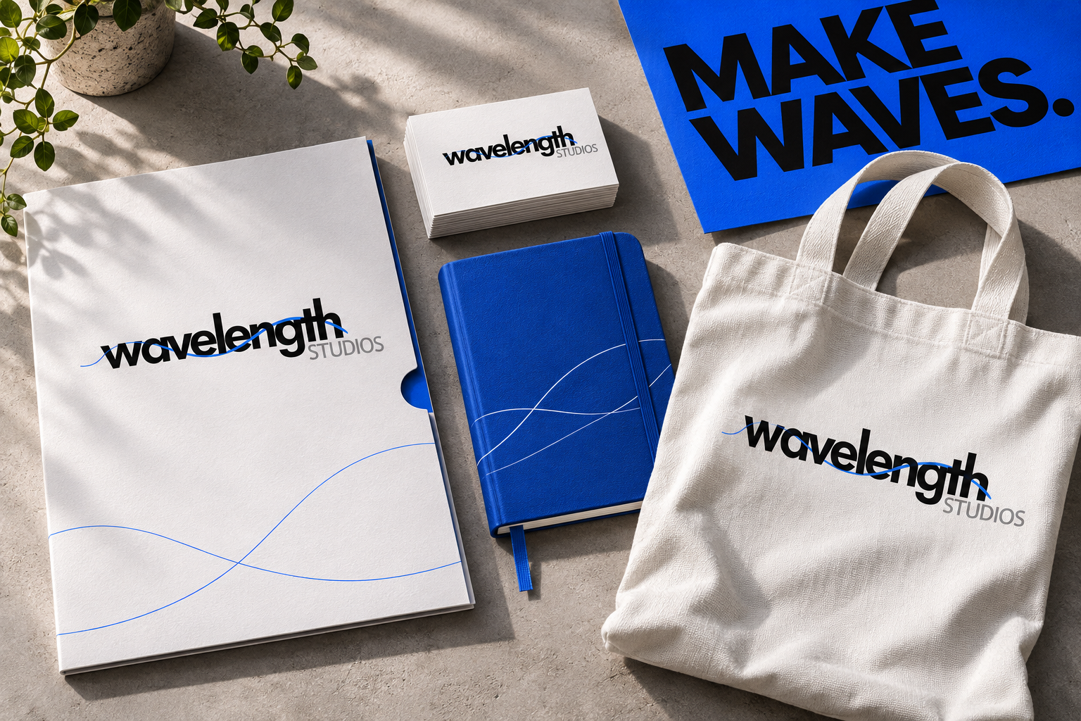
The photographed studio kit is an AI-generated mockup; the logo board and downloadable posters use the original artwork directly.